Embed configuration
Configure a self-service workflow that can be embedded in our existing digital customer journey
Overview
You can configure the Embed flow for your product in the workflows > embed-config.json file in your product module workbench directory.
The following snippet shows the high-level file structure along with providing guidance to what configurations are applicable to either the Sales add-on, the Management add-on, or both:
{
  //Applicable to both Sales and Management
  "styles" : { ... },
  "settings" : { ... },
  "header": { ... },
  "footer": { ... },
  //Applicable to Sales only
  "landing": { ... },
  "quote": { ... },
  "prePersonalDetailsCompliance" : { ... },
  "personalDetails": { ... },
  "application": { ... },
  "beneficiaries": { ... },
  "prePaymentCompliance": { ... },
  "payment": { ... },
  "confirmation": { ... },
  //Applicable to Management only
  "management": { ... },
}
Aside from the the styles and settings sections, each section is broken down into further sub-sections representing specific items on the page.
| Setting | Definition |
|---|---|
wording | Object. This is where your desired copy is configured. |
images | Object. This is a collection of links to the required images. When including an image we recommend using S3 or Google Cloud Storage for performance and stability. |
links | Object. This contains any links that are required for the components. |
displayOptionalSections | Object. This is used to enable / disable various optional components of the flow. If you have included wording for an optional section that you have chosen not to display, the corresponding configurations will be ignored. |
Styles
The Embed styles section is where you can configure colours and other styling options applicable to the entire Embed flow. The Embed styles are broken down into the following subsections:
Setting | Definition |
|---|---|
|
This is also where you are able to configure the colour of the policy status badges on the policy details screen. |
|
|
|
|
|
|
|
|
An example is provided below:
{
  "styles": {
    "borderRadius": {
      "button": "8px"
    },
    "colors": {
      "dark": "#00000",
      "error": "#ff2b38",
      "light": "#FFFFFF",
      "border": "rgba(0, 0, 0, 0.125)",
      "primary": "#240E8B",
      "success": "#1fc881",
      "warning": "#FC64B1",
      "disabled": "#CDD4DE",
      "highlight": "#FC64B1",
      "backgroundHighlight": "rgba(245, 247, 252, 1)",
      "policyStatusActive": "#1fc881",
      "policyStatusPending": "#ffab00",
      "policyStatusCancelled": "#d50001",
      "policyStatusExpired": "#ffab00",
      "policyStatusNotTakenUp": "#d50001",
      "policyStatusLapsed": "#d50001"
    },
    "fontFamily": {
      "title": "Lato",
      "body": "Lato"
    },
    "fontSize": {
      "body": "16px",
      "title": "40px",
      "button": "14px",
      "subTitle": "22px",
      "subscript": "8px",
      "footer": "8px",
    },
    "disableSteppedComponents": false
  },
}
Settings
The settings section allows for configuration of Embed.
| Setting | Definition |
|---|---|
defaultCountryCodeFromBrowser | Boolean. When enabled will infer the country from the browser. |
supportType | String. This determines the support link type. Either email, url or overrideMessage. |
supportUrl | Object. This provides a link that users can click if they experience any issues |
supportEmail | String. The support email address users must reach out to if they experience any issues. |
overrideSupportMessage | String. Override the support message on the error component with a plain string. This requires the supportType to be configured as overrideMessage |
issuingFlowStartingStep | String. This determines the starting step for the policy issuing flow. It can be set to either default or personalDetails. Setting it to personalDetails will change the flow so that personal details are captured before the quote capture is displayed. |
mixpanelProjectToken | String. Provide your Mixpanel Project Token to enable tracking of user behavior and insights throughout the customer journey. You can find your Mixpanel Project Token under your project settings on Mixpanel. |
An example is provided below:
{
  "settings": {
    "issuingFlowStartingStep": "default",
    "defaultCountryCodeFromBrowser": true,
    "supportType": "email",
    "supportEmail": "[email protected]",
    "overrideSupportMessage": "Something went wrong, please contact support if the problem persists."
    "mixpanelProjectToken": "<mixpanel_project_token>"
  },
}
Header and footer
The header and footer are displayed on multiple stages of the Sales add-on.
The header component controls three elements:
- The optional logo that can be displayed at the top of the landing page
- The header text that is visible on all stages of the Sales add-on
- The optional premium value that can be be shown in the progress bar
To enable the logo, you need to set displayOptionalSections.titleImage to true and configure its URL with the titleUrl key.
The footer component is displayed on all sections of the iframe and is used to display the underwriter’s disclaimer paired with an optional logo.
To enable the logo, you need to set displayOptionalSections.disclaimerImage to true and configure its URL with the disclaimerUrl key.
To enable showing the current premium value in the progress bar, set displayOptionalSections.premiumInProgressBar to true.
Here is an example configuration:
{
  "header": {
    "wording": {
      "title": "Get Dinosure"
    },
    "images": {
      "titleUrl": ""
    },
    "links": {},
    "displayOptionalSections": {
      "title": true,
      "titleImage": false,
      "premiumInProgressBar:" false
    }
  },
  "footer": {
    "wording": {
      "disclaimer": "Dinosure is a sample application by Root. The source code is MIT licensed, while the website content is licensed CC BY NC SA 4.0. Dinosure Services (Pty) Ltd is an unauthorised financial services provider. FSP number: 123456. 3 Sauropoda Lane, Isla Nublar, 1337"
    },
    "images": {
      "disclaimerUrl": "https://storage.googleapis.com/root-production-public-client-images/Dinosure%20Demo/root-logo.svg"
    },
    "links": {},
    "displayOptionalSections": {
      "disclaimerImage": true
    }
  }
}
Embed | Sales
The Sales add-on provides a complete mobile-responsive sales flow for quote generation and policy issuing through a white-labelled customer-facing frontend.
Landing page
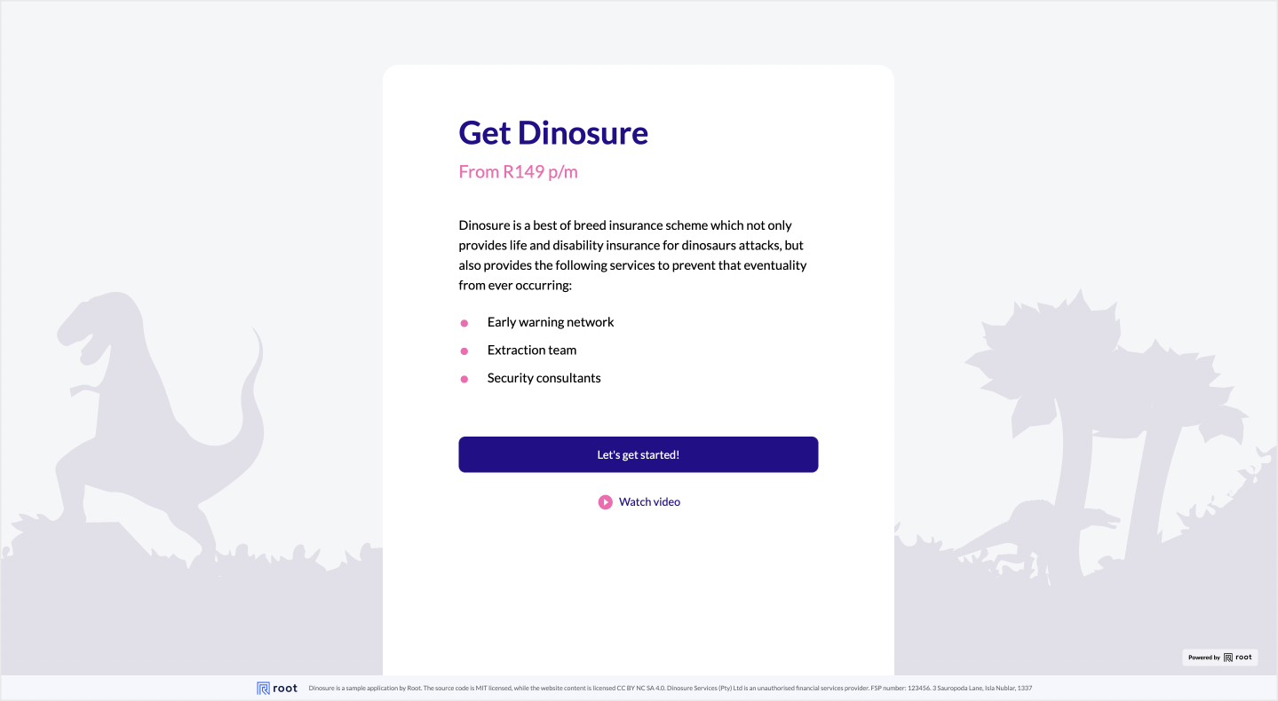
The landing page is the entry point to the Sales add-on. You can use it to inform your customers about your product and encourage them to take out cover.
The following sections of the landing page are optional and can be enabled or disabled in the config file:
| Setting | Definition |
|---|---|
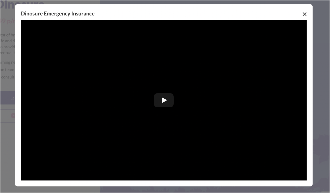
watchVideo | Boolean. Enable this section if you want to add a Youtube video to the landing page. You can configure this section through the wording.videoTitle and by providing a link to a Youtube video, or a Youtube video ID in the links.youTubeVideoId setting. |
descriptionBullets | Boolean. This section allows you to give a short introduction to your product. You can edit this section in the wording.descriptionBullets option. The value is an array of strings, each item in the array representing a bullet point. |
displayLandingPage | Boolean. Set this to false to bypass the landing page. |
An example is provided below. Please see the screenshots, which shows which options apply to which parts of the landing page.
{
  "landing": {
    "wording": {
      "title": "Get Dinosure",
      "subTitle": "From R149 p/m",
      "description": [
        "Dinosure is a best of breed insurance scheme which not only provides life and disability insurance for dinosaurs attacks, but also provides the following services to prevent that eventuality from ever occurring:"
      ],
      "descriptionBullets": ["Early warning network", "Extraction team", "Security consultants"],
      "createQuoteButton": "Let's get started!",
      "videoTitle": "Dinosure Emergency Insurance"
    },
    "images": {
      "background": "https://storage.googleapis.com/root-production-public-client-images/Dinosure%20Demo/dinosure-grey-background.svg"
    },
    "links": {
      "youTubeVideoId": "PJlmYh27MHg"
    },
    "displayOptionalSections": {
      "watchVideo": true,
      "descriptionBullets": true,
      "displayLandingPage": true

    }
  }
}
Quote step
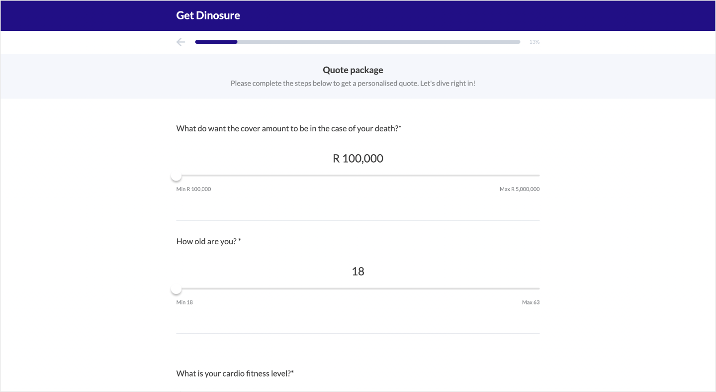
In this step, the user will fill in all the necessary details to receive a quote. The fields on this page are based on the product module quote schema and do not need to be configured in the config file. For more information on how to configure a quote schema for your product, see the schemas schemas guide.
The following sections of the quote page are optional and can be enabled or disabled in the config file:
Setting | Definition |
|---|---|
|
|
|
|
|
|
|
|
|
|
|
|
You can make small copy and design tweaks in the configuration file, see below for more details.
{
  "quote": {
    "wording": {
      "title": "",
      "description": "Please complete the steps below to get a personalised quote. Let's dive right in!",
      "coverRejected": "life cover",
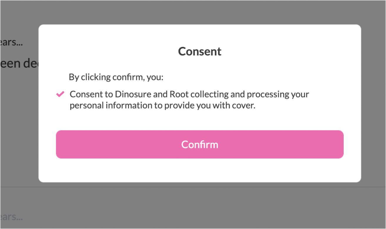
      "consentDisclaimer": {
        "consentItems": [
          "Consent to Dinosure and Root collecting and processing your personal information to provide you with cover."
        ],
        "title": "Consent"
      },
      "screeningQuestions": [
        {
          "key": "declined_cover",
          "header": "In the last 5 years...",
          "question": "Have you been declined or deferred cover by a life insurance company?"
        },
        {
          "key": "admitted_hospital",
          "header": "In the last 5 years...",
          "question": "have you been admitted to a hospital or clinic for longer than 48 hours?"
        }
      ],
      "screeningQuestionsDescription": "Before we begin, let’s make sure our term life offering is the correct cover solution for you.",
      "screeningQuestionsRejected": "Our term life offering is unfortunately not the best solution for you.",
      "callToAction": "Sign me up!",
      "premiumTitle": "You pay"
    },
    "images": {},
    "supportType": "url",
    "links": {
      "supportUrl":
      	{
          "label": "support",
          "url": "https://support.rootplatform.com/hc/en-us/requests/new"
        }
    },
    "displayOptionalSections": {
      "consentDisclaimer": true,
      "screeningQuestions": true,
      "screeningQuestionsRetry": true
    }
  }
}

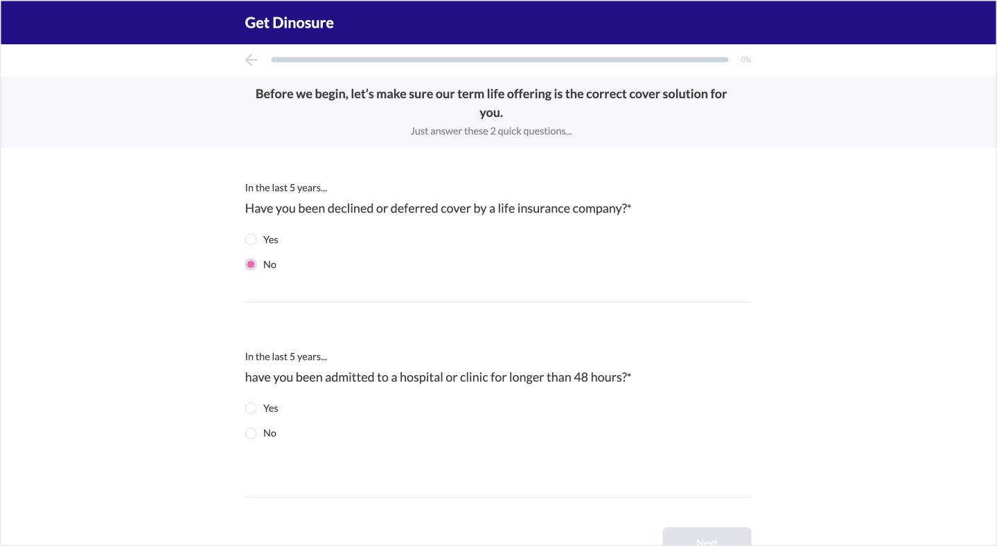
Screening questions
This is an optional section that allows you to ask the user a series of yes or no questions. If the user answers any of these questions with no, they will be blocked from continuing with the flow. You can configure whether you want to allow the user to retry the questions by setting the displayOptionalSections.screeningQuestionsRetry flag in the quote object to true. This will provide the user with the option to retry the questions if they enter a no value.
To enable the screening questions, set the displayOptionalSections.screeningQuestions flag in the quote object to true. Make sure to add any of your screening questions to the validateQuoteRequest and getQuote functions in the product module code, as they will be included as properties of the data parameter passed to these functions.
You can set your screening questions in the wording.screeningQuestions section of the quote object, as shown in the example below.
{
  "screeningQuestions": [
        {
          "key": "declined_cover",
          "header": "In the last 5 years...",
          "question": "Have you been declined or deferred cover by a life insurance company?"
        },
        {
          "key": "admitted_hospital",
          "header": "In the last 5 years...",
          "question": "have you been admitted to a hospital or clinic for longer than 48 hours?"
        }
      ],
}
Quote split
The Embed | Sales flow provides the option to split the quote step inputs into multiple separate steps. This functionality helps decrease the initial number of inputs presented to customers when they start the process of getting a quote.
To implement quote splitting in your Embed flow, add the sectionIndex property to the schema component.
| Properties | |
|---|---|
"sectionIndex" |
[
  {
    "type": "text",
    "key": "<unique_key>",
    "label": "Contact name *",
    "sectionIndex": 1
  },
  {
    "type": "text",
    "key": "<unique_key>",
    "label": "Contact last name *",
    "sectionIndex": 2
  }
]
Pre-personal details compliance
This is an optional step that allows you to add terms and conditions to the Sales add-on. This step will be displayed before the personal details step. You can configure the body of the terms and conditions in the documents > pre-personal-details.md file in workbench.
To enable this step, simply set the displayPrePersonalDetailsCompliance flag to true. An example is provided below.
{
  "prePersonalDetailsCompliance": {
    "wording": {
      "title": "Pre personal details compliance",
      "description": "Let’s sign you up! Read the following terms and conditions before proceeding..."
    },
    "images": {},
    "links": {
      "exitRedirect": "https://dinoparks.net/"
    },
    "displayOptionalSections": {
      "displayPrePersonalDetailsCompliance": true
    }
  }
}Lorem ipsum dolor sit amet, consectetur adipiscing elit. Proin pellentesque a nibh vitae hendrerit. Suspendisse rutrum leo in libero consectetur, sit amet iaculis leo scelerisque. Nam non arcu maximus, eleifend ex vitae, mattis urna. Duis orci lectus, ultrices et mi sit amet, volutpat gravida eros. Vivamus at semper nisl. Maecenas in velit lectus.
• Donec condimentum urna arcu. Mauris semper diam et purus elementum consectetur.
• Suspendisse sit amet eros a lacus rhoncus dignissim quis in dolor.
Mauris massa diam, blandit quis metus eu, maximus posuere ipsum. Nullam eleifend maximus mi ut sagittis. Vestibulum vulputate, ex quis pellentesque laoreet, nisi purus efficitur neque, vel aliquet ipsum enim at elit.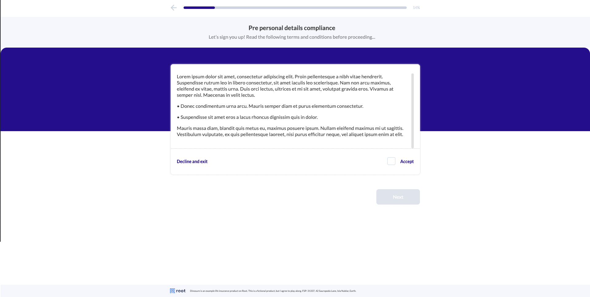
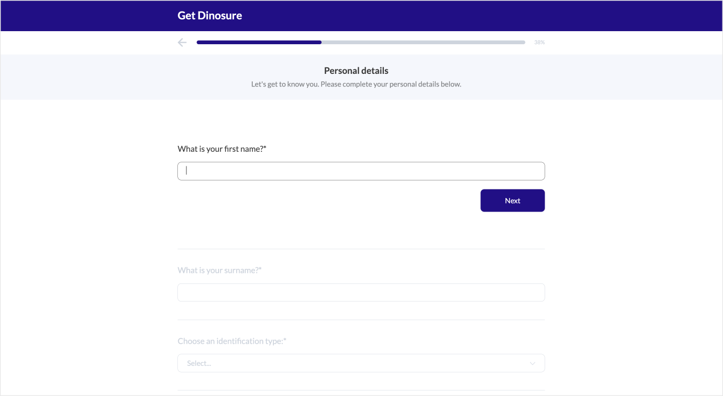
Personal details step
In this step, the user will fill in their personal details. The fields that are captured in this section depend on the product module settings . For example, if the settings allow for multiple identification types, the form will allow the user to select their identification type and update dynamically. You can use the settings to enable company policyholders, allowing company-relevant fields to be captured. You can also set up Fetchify Address Autocomplete for your Embed flow, to make it easier for your customers to input their address details.
Setting | Definition |
|---|---|
|
|
|
|
An example is provided below.
{
  "personalDetails": {
    "wording": {
      "title": "Personal details",
      "description": "Let's get to know you. Please complete your personal details below."
    },
    "links": {},
    "images": {},
    "displayOptionalSections": {
      "skipOnPrefill": true,
      "contactDetailTypes": [
        "email",
        "cellphone"
      ],
      "fetchifyAutocomplete": true
    }
  }
}
Input fields
To customize the input fields on the "Personal Details" step, navigate to the file input-fields.json, located in the workflows/embed folder. In this file, you can customise labels and specify prefill actions. The identificationNumber field accommodates dynamic values, which can be passed as {{selected_identification_type}} and will be substituted with the selected identification type.
An example is provided below.
{
  "personalDetails": {
    "city": {
      "label": "What is your city?",
      "prefillAction": "none"
    },
    "email": {
      "label": "What is your email address?",
      "prefillAction": "hidden"
    },
    "gender": {
      "label": "What is your gender?",
      "prefillAction": "disabled"
    },
    "idType": {
      "label": "Choose an identification type:",
      "prefillAction": "none"
    },
    "suburb": {
      "label": "What is your suburb?",
      "prefillAction": "none"
    },
    "country": {
      "label": "What is your country?",
      "prefillAction": "none"
    },
    "areaCode": {
      "label": "What is your area code?",
      "prefillAction": "none"
    },
    "lastName": {
      "label": "What is your surname?",
      "prefillAction": "none"
    },
    "cellphone": {
      "label": "What is your mobile number?",
      "prefillAction": "none"
    },
    "firstName": {
      "label": "What is your main name?",
      "prefillAction": "none"
    },
    "companyName": {
      "label": "What is your company's name?",
      "prefillAction": "none"
    },
    "dateOfBirth": {
      "label": "What is your date of birth?",
      "prefillAction": "none"
    },
    "addressLine1": {
      "label": "Address line 1.",
      "prefillAction": "none"
    },
    "addressLine2": {
      "label": "Address line 2.",
      "prefillAction": "none"
    },
    "addressOptIn": {
      "label": "Would you like to add your physical address?",
      "prefillAction": "none"
    },
    "contactPosition": {
      "label": "What is your position?",
      "prefillAction": "none"
    },
    "policyholderType": {
      "label": "Are you an individual or a company?",
      "prefillAction": "none"
    },
    "companyWebsiteUrl": {
      "label": "What is your company website url?",
      "prefillAction": "none"
    },
    "registrationNumber": {
      "label": "What is your company registration number?",
      "prefillAction": "none"
    },
    "dateOfEstablishment": {
      "label": "When was the company established?",
      "prefillAction": "none"
    },
    "subsidiaryCompanies": {
      "label": "Please list your subsidiary companies?",
      "prefillAction": "none"
    },
    "identificationNumber": {
      "label": "What is your {{selected_identification_type}} number?",
      "prefillAction": "none"
    },
    "identificationCountry": {
      "label": "What country is your {{selected_identification_type}} from?",
      "prefillAction": "none"
    },
    "identificationExpirationDate": {
      "label": "What is the expiration date on your {{selected_identification_type}}?",
      "prefillAction": "none"
    }
  }
}
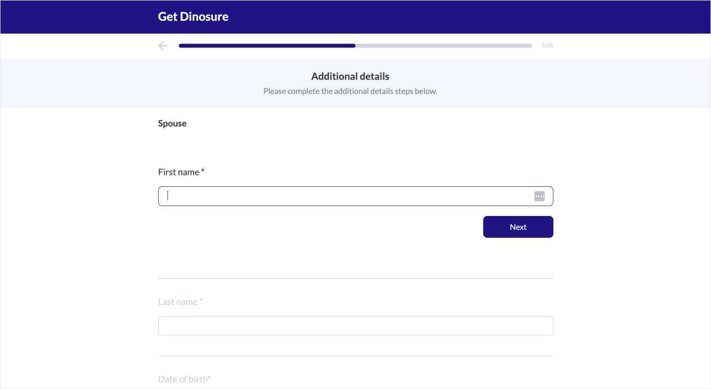
Application step
In this step, additional information can be gathered from the customer. The only option that can be configured under this section is wording.description, which determines the text that appears as a description for this step.
The input fields in this step are derived from the product module's application schema, and do not need to be configured in the configuration file. This includes the ability to conditionally render fields based on the data received at the quote step. If the product module does not include an application schema, this stage will be skipped in the user flow.
You can read more about how to configure an application schema for your product in the schemas guide. If you have not configured an application schema, this section will be skipped in the user flow.
{
  "application": {
    "wording": {
      "title": "Additional details",
      "description": "Please complete the additional details steps below."
    },
    "images": {},
    "links": {},
    "displayOptionalSections": {}
  }
}
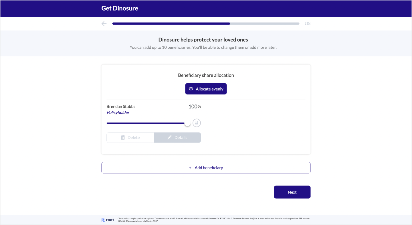
Beneficiaries step
This is an optional step that allows a user to add beneficiaries to their policies. In your product module settings, you can configure whether the policyholder is automatically added as a beneficiary to the policy.
To enable this step, set the displayManageBeneficiaries flag to true.
{
  "beneficiaries": {
    "wording": {
      "title": "Dinosure helps protect your loved ones",
      "description": "Let’s list them as your beneficiaries here. You can add up to 10 beneficiaries now. You’ll be able to change them or add more later."
    },
    "images": {},
    "links": {},
    "displayOptionalSections": {
      "displayManageBeneficiaries": true
    }
  }
}
Input fields
In order to customise the input fields on the personal details step, you can do so in the file input-fields.json located in the workflows/embed folder. The field identificationNumber allows for a dynamic value, which can be passed as {{selected_identification_type}} and will be replaced with the selected identification type.
An example is provided below
{
  "beneficiaries": {
    "email": {
      "label": "Email address"
    },
    "title": {
      "label": "Title"
    },
    "gender": {
      "label": "Gender"
    },
    "idType": {
      "label": "Identification type"
    },
    "lastName": {
      "label": "Surname"
    },
    "cellphone": {
      "label": "Mobile number"
    },
    "firstName": {
      "label": "Name"
    },
    "relationship": {
      "label": "Relationship"
    },
    "identificationNumber": {
      "label": "{{selected_identification_type}} number"
    },
    "identificationCountry": {
      "label": "Country"
    }
  }
}
Pre-payment compliance
This is an optional step that allows you to add terms and conditions to the Sales add-on. This step will be displayed before the payment details step. The body of the terms and conditions can be configured in the documents > pre-payment-details.md file, in workbench.
To enable this step, simply set the displayPrePaymentDetailsCompliance flag to true.
{
  "prePaymentCompliance": {
    "wording": {
      "title": "Pre payment details compliance",
      "description": "Let’s sign you up! Read the following terms and conditions before proceeding..."
    },
    "images": {},
    "links": {
      "exitRedirect": "https://dinoparks.net/"
    },
    "displayOptionalSections": {
      "displayPrePaymentDetailsCompliance": true
    }
  }
}Lorem ipsum dolor sit amet, consectetur adipiscing elit. Proin pellentesque a nibh vitae hendrerit. Suspendisse rutrum leo in libero consectetur, sit amet iaculis leo scelerisque. Nam non arcu maximus, eleifend ex vitae, mattis urna. Duis orci lectus, ultrices et mi sit amet, volutpat gravida eros. Vivamus at semper nisl. Maecenas in velit lectus.
• Donec condimentum urna arcu. Mauris semper diam et purus elementum consectetur.
• Suspendisse sit amet eros a lacus rhoncus dignissim quis in dolor.
Mauris massa diam, blandit quis metus eu, maximus posuere ipsum. Nullam eleifend maximus mi ut sagittis. Vestibulum vulputate, ex quis pellentesque laoreet, nisi purus efficitur neque, vel aliquet ipsum enim at elit.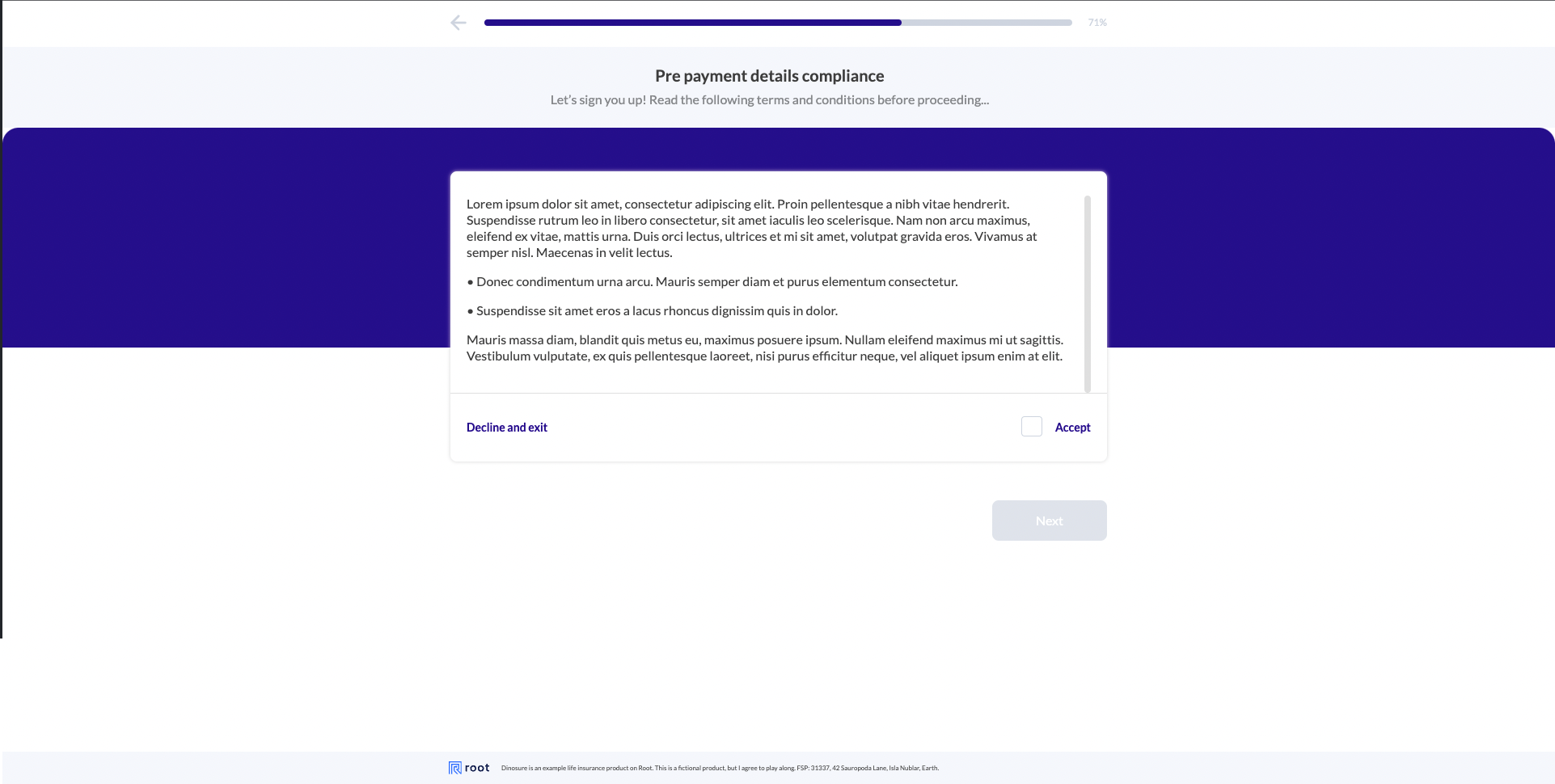
Payment step
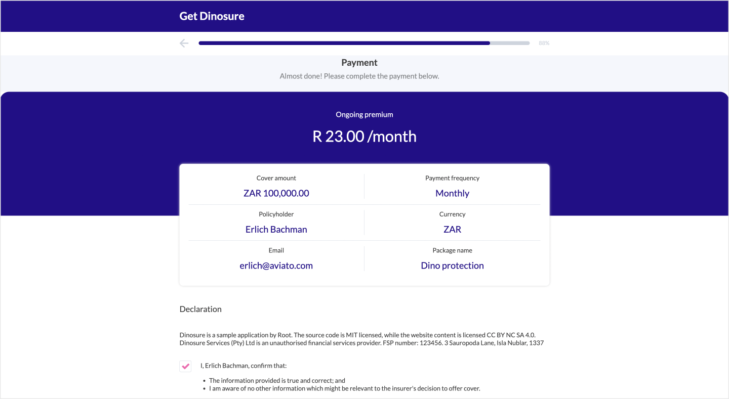
This step displays a summary of the policy details and captures the user's payment details.
By default, the external reference is set to the policyholder_id concatenated with a timestamp when using an external payment method. Use prefill values to pass in a custom external reference.
You can configure the policy detail blocks at the top of the section using handlebars in the wording.summary array.
You can configure any number of handlebars fields for the payment summary page. If more than six fields are specified, the grid view will convert to the module data view with the handlebars values.
Setting | Definition |
|---|---|
|
|
|
|
|
|
{
  "payment": {
    "wording": {
      "title": "Payment",
      "description": "Almost done! Please complete the payment below.",
      "consentItems": [
        "The information provided is true and correct.",
        "I am aware of no other information which might be relevant to the insurer's decision to offer cover.",
      ],
      "consentIdentifierOverride": "I, the policyholder confirm that:",
      "summary": [
        {
          "label": "Cover amount",
          "content": "{{formatCurrency application.sum_assured application.currency}}"
        },
        {
          "label": "Payment frequency",
          "content": "{{toStartCase application.billing_frequency}}"
        },
        {
          "label": "Policyholder",
          "content": "{{application.policyholder.first_name}} {{application.policyholder.last_name }}"
        },
        {
          "label": "Currency",
          "content": "{{application.currency}}"
        },
        {
          "label": "Email",
          "content": "{{application.policyholder.email}}"
        },
        {
          "label": "Package name",
          "content": "{{application.package_name}}"
        }
      ],
      "declaration": "Dinosure is a sample application by Root. The source code is MIT licensed, while the website content is licensed CC BY NC SA 4.0. Dinosure Services (Pty) Ltd is an unauthorised financial services provider. FSP number: 123456. 3 Sauropoda Lane, Isla Nublar, 1337"
    },
    "images": {},
    "links": {},
    "displayOptionalSections": {
      "displayPaymentMethod": true,
      "billingDay": true
    }
  }
}
Confirmation page
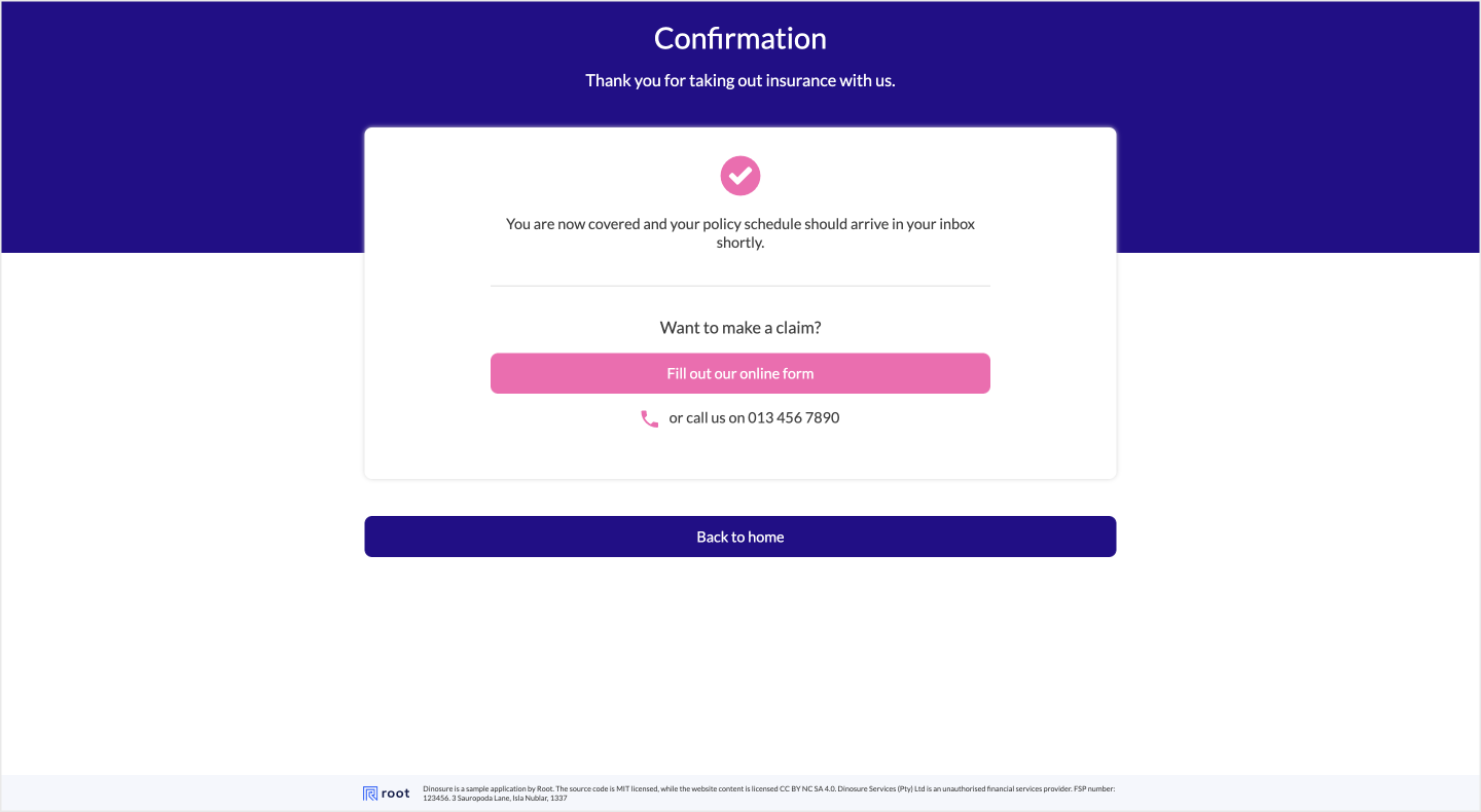
This is the final step in the Sales add-on, where the user is informed that the policy has been issued. The options that can be configured for this step are as follows:
| Setting | Definition |
|---|---|
contactNumber | Boolean. When enabled, the flow will will render the contactDescription and contactNumber values. |
displayConfirmation | Boolean. When enabled, a confirmation screen will be displayed, which can be configured using the parameters outlined below. |
contactNumberDescription | Boolean. When enabled, a description will be prefixed to the contact number. |
secondarySubTitle | Boolean. When enabled, the secondary subtitle will be displayed. |
secondaryButton | Boolean. When enabled, the secondary button will be displayed. |
primaryButton | Boolean. When enabled, the primary button will be displayed. |
An example is provided below.
{
    "wording": {
      "title": "Confirmation",
      "subTitle": "Thank you for taking out insurance with us.",
      "description": "You are now covered and your policy schedule should arrive in your inbox shortly.",
      "contactNumberDescription": "or call us on",
      "contactNumber": "013 456 7890",
      "secondarySubTitle": "Want to make a claim?",
      "secondaryButton": "Fill out our online form",
      "primaryButton": "Back to home"
    },
    "images": {},
    "links": {
      "openClaim": "https://dinoparks.net/claims",
      "redirectOnCompletedUrl": "https://dinoparks.net/"
    },
    "displayOptionalSections": {
      "contactNumber": true,
      "displayConfirmation": true,
      "secondaryButton": true,
      "secondarySubTitle": true,
      "contactNumberDescription": true,
      "primaryButton": true
    }
  }
Embed | Management
The Root Embed | Management Add-on provides a complete mobile-responsive self-service solution for policy management that can be embedded in a web application. It allows users to perform the following actions on their policy:
- View policy details
- Make cover changes based on the available alteration hooks for the product module
- Cancel the policy
- Manage beneficiaries
- Change the collection day
- Update the payment method
The configuration for the Management add-on is located in the file workflows > embed-config.json in the product module workbench directory. The following sections are nested within the management object on the embed-config.json file.
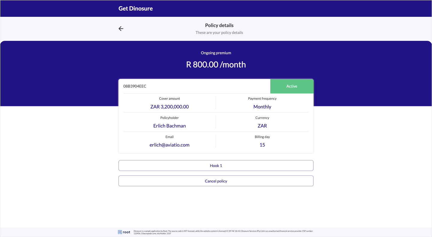
Policy details
The policy details screen provides users with a configurable summary of their policy information, as well as a list of available alteration hooks. Users can also cancel their policy on this screen. The back button can be configured to redirect the user to a custom page instead of the default policy view screen using the exitRedirect parameter.
In order to configure the colour of the policy status badge, please see the styles section
{
  "policyDetails": {
      "wording": {
        "title": "Policy details",
        "description": "These are your policy details",
        "summary": [
          {
            "label": "Cover amount",
            "content": "{{formatCurrency policy.sum_assured policy.currency}}"
          },
          {
            "label": "Payment frequency",
            "content": "{{toStartCase policy.billing_frequency}}"
          },
          {
            "label": "Policyholder",
            "content": "{{policy.policyholder.first_name}} {{policy.policyholder.last_name }}"
          },
          {
            "label": "Currency",
            "content": "{{policy.currency}}"
          },
          {
            "label": "Email",
            "content": "{{policy.policyholder.email}}"
          },
          {
            "label": "Billing day",
            "content": "{{policy.billing_day}}"
          }
        ]
      },
      "images": {},
      "links": {
        "exitRedirect": "https://dinoparks.net/"
      },
      "displayOptionalSections": {
        alterationHooks: {
          "key": "my_alteration_hook",
          enabled: true
        }
      }
    }
}
Beneficiaries
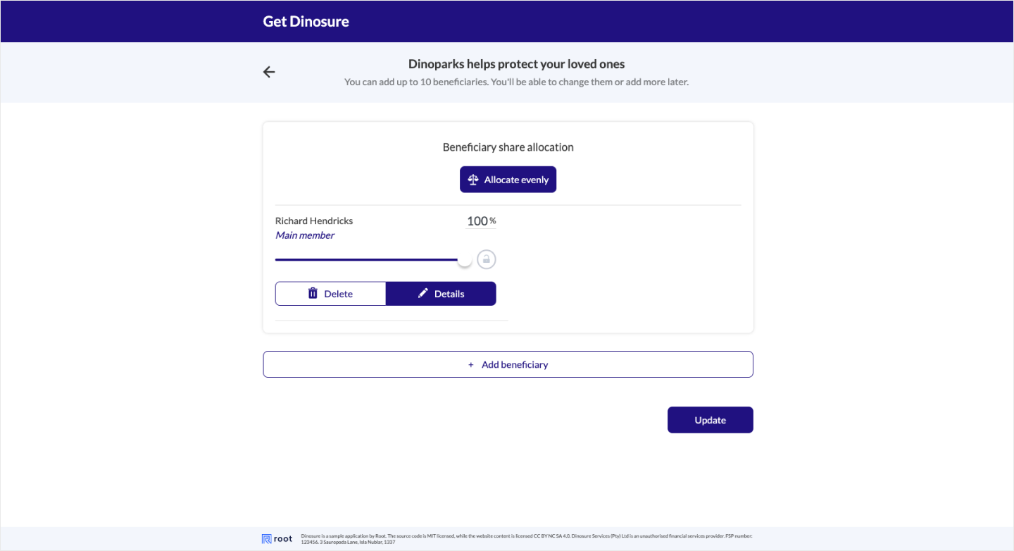
The beneficiaries screen allows users to add and update beneficiaries on their policies. The back button can be configured to redirect the user to a custom page instead of the default policy view screen using the exitRedirect parameter.
{
  "beneficiaries": {
    "wording": {
      "title": "Dinoparks helps protect your loved ones"
    },
    "images": {},
    "links": {
      "exitRedirect": ""
    },
    "displayOptionalSections": {}
  }
}
Payment
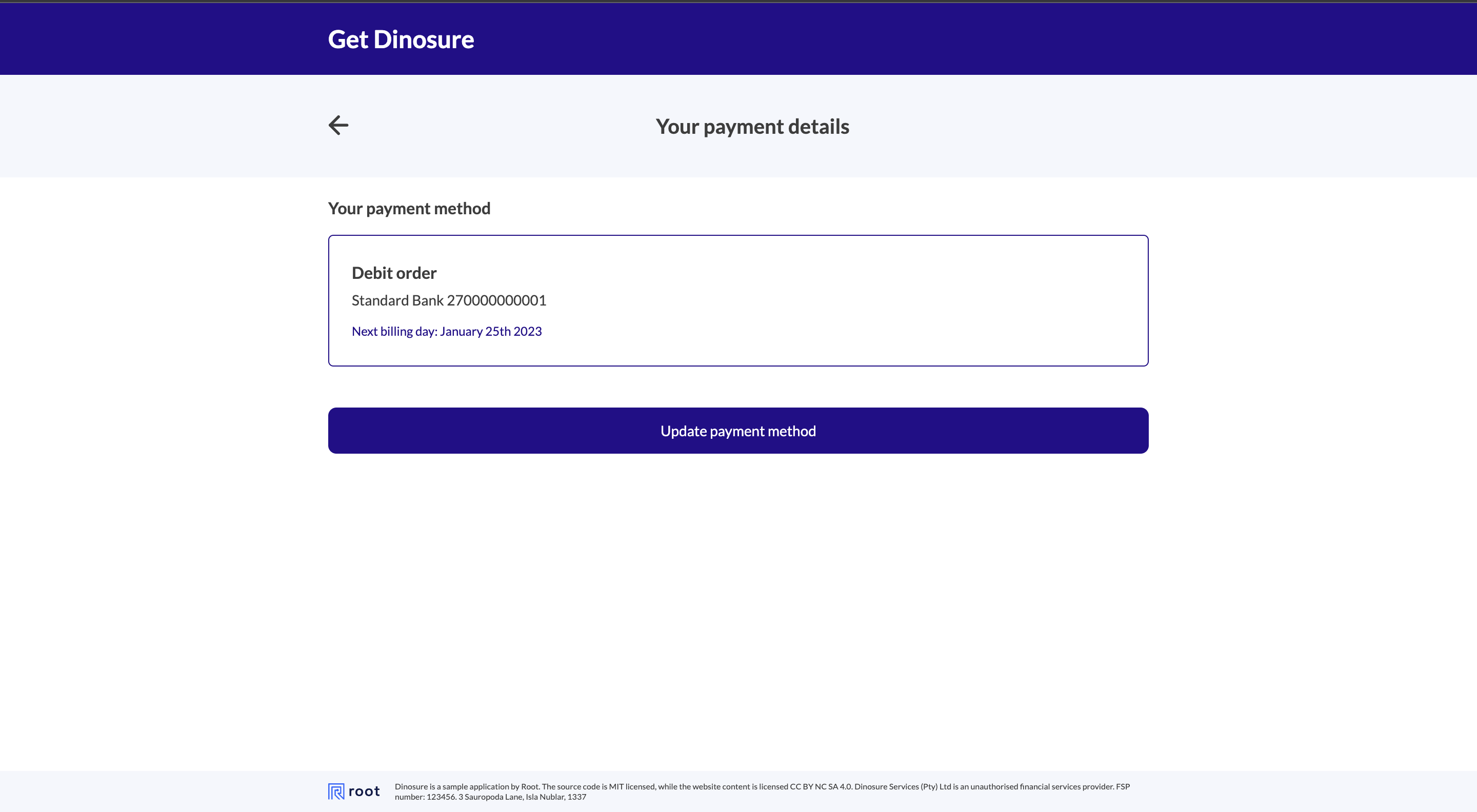
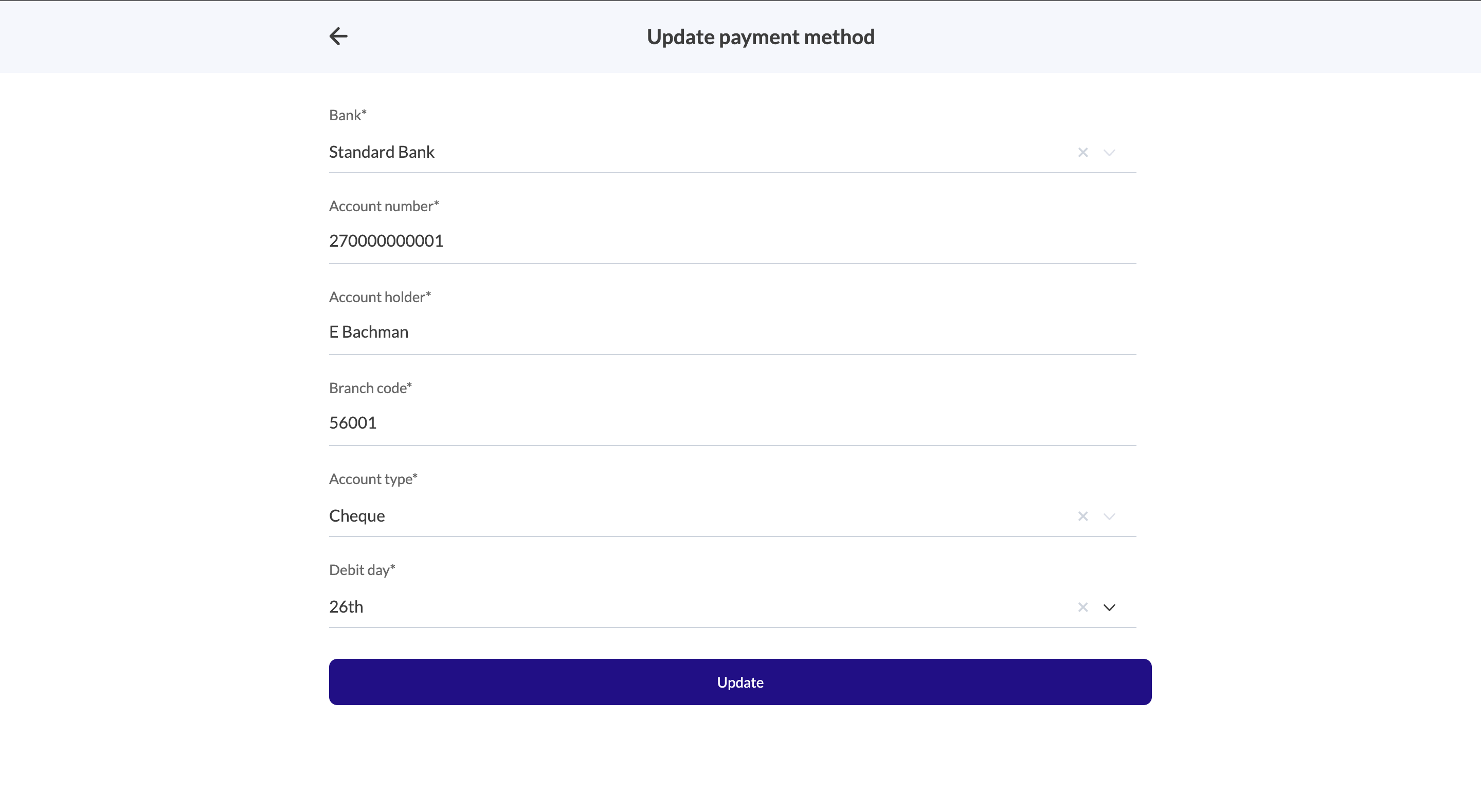
The payment screen provides users with the ability to update their payment details and/or the billing day on their policy. This section is optional and can be disabled by setting all of the displayOptionalSection parameters to false. The back button can be configured to redirect the user to a custom page instead of the default policy view screen using the exitRedirect parameter.
{
  "payment": {
    "wording": {
      "title": "Payment summary",
      "description": "Please complete your payment details"
    },
    "images": {},
    "links": {
      "exitRedirect": ""
    },
    "displayOptionalSections": {
      "editBillingDay": true,
      "editPaymentMethod": true,
      "viewPaymentMethod": true
    }
  }
}
Claims
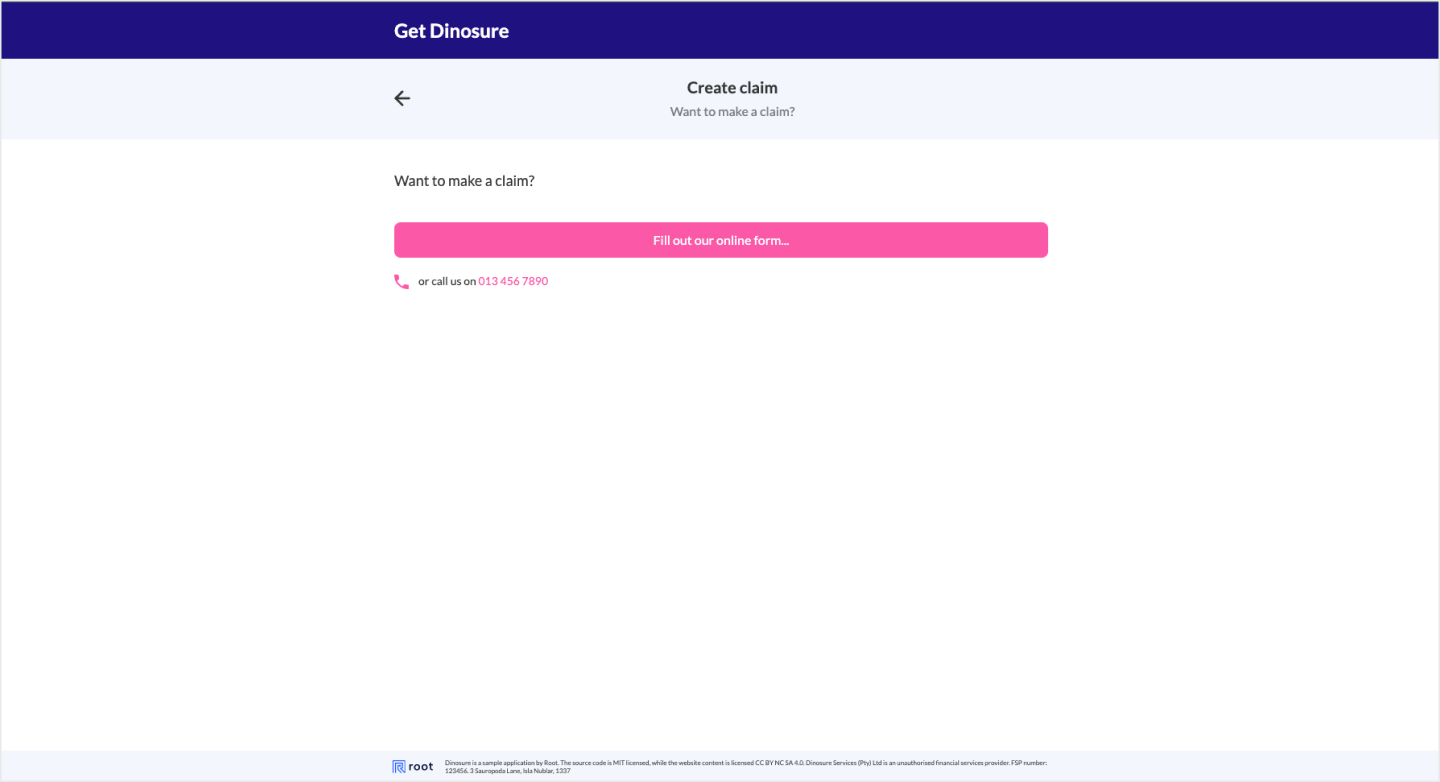
The claims screen provides users with instructions on how to open a claim on their policy. The back button can be configured to redirect the user to a custom page instead of the default policy view screen using the exitRedirect parameter.
| Setting | Definition |
|---|---|
callToAction | Boolean When enabled this will render a button that can be named using the wording.callToAction string with the link defined under links.openClaim. |
contactNumber | Boolean If enabled will render the contactNumber value. |
{
  "claim": {
    "wording": {
      "title": "Create claim",
      "description": "Want to make a claim?",
      "contactNumber": "013 456 7890",
      "callToAction": "Fill out our online form..."
    },
    "images": {},
    "links": {
      "exitRedirect": "",
      "openClaim": "https://dinoparks.net/claims"
    },
    "displayOptionalSections": {
      "callToAction": true,
      "contactNumber": true
    }
  }
}
Personal details
The personal details section allows users to edit their personal details. The back button can be configured to redirect the user to a custom page instead of the default policy view screen using the exitRedirect parameter.
{
  "personalDetails": {
    "wording": {
      "title": "Personal details",
      "description": "Edit your personal details."
    },
    "images": {},
    "links": {
      "exitRedirect": ""
    },
    "displayOptionalSections": {}
  }
}
Updated 3 months ago