Claims blocks reference
Customise the information that needs to be captured on a claim
Overview
This guide is a reference for the different display and form element block types that can be included in a claims blocks schema. Read more about how claims blocks fit into the broader claims workflow in the claims workflow overview guide. Read more about how claims blocks work and how they are linked to other aspects of the product module build in the claims blocks overview guide.
Block categories
Three categories of blocks can be defined in the claims blocks schema:
- Display blocks- These blocks neither accept nor store any input. They are included in the claim's block states but do not have a value attribute.
- Form element blocks- These blocks render on the claim description form as form inputs. They accept and store input values in block states.
- Disbursement blocks - This is a special category of blocks that facilitate the transfer of monetary and non-monetary compensation to beneficiaries.
Alert
A text block that displays important information to the user. You can specify one of a predefined set of color schemes to customise the alert's meaning or severity.
Properties
| Property | Definition |
|---|---|
"key" | String. The unique identifier of this block. |
"type" | String. The block type. In this case, "alert". |
"markdown" | String. The content that will be parsed as markdown and rendered inside the alert. |
"color" | String. Sets the display color of the alert to indicate severity. One of ["success", "danger", "warning", "info"]. |
Example
{
    "block": {
        "key": "claim_within_waiting_period",
        "type": "alert",
        "markdown": "This claim is still within the waiting period.",
        "color": "warning"
    }
}
State
| Property | Definition |
|---|---|
"type" | String. The block type. In this case, "alert". |
{
  "claim": {
    "block_states": {
      "claim_within_waiting_period": {
        "type":"alert"
      }
    },
   ...
  }
}
Heading
A text block that will render a heading on screen. Useful for grouping input fields under the same category.
Properties
| Property | Definition |
|---|---|
"key" | String. The unique identifier for this block. |
"type" | String. The block type, in this case "heading". |
"title" | String. The text that will be rendered as a heading. |
Example
{
    "block": {
        "key": "payout_details",
        "type": "heading",
        "title": "Payout details"
    }
}
State
| Property | Definition |
|---|---|
"type" | String. The block type, in this case "heading". |
{
  "claim": {
    "block_states": {
      "payout_details": {
        "type":"heading"
      }
    },
   ...
  }
}
Markdown
A text block that will parse and render given text content according to the markdown specification.
Properties
| Property | Definition |
|---|---|
"key" | String. The unique identifier for this block |
"type" | String. The block type, in this case "markdown". |
"markdown" | String. The content to be parsed as markdown and rendered. |
Example
{
    "block": {
        "key": "fsca_information",
        "type": "markdown",
        "markdown": "For more information see [here](https://www.fsca.co.za/)"
    }
}
State
| Property | Definition |
|---|---|
"type" | String. The block type, in this case "markdown". |
{
  "claim": {
    "block_states": {
      "fsca_information": {
        "type":"markdown"
      }
    },
   ...
  }
}
Divider
A block that will render a horizontal line on screen to separate sections of input fields.
Properties
| Property | Definition |
|---|---|
"key" | String .The unique identifier for this block |
"type" | String. The block type, in this case "divider". |
Example
{
    "block": {
        "key": "section_divider",
        "type": "divider"
    }
}
State
| Property | Definition |
|---|---|
"type" | String. The block type, in this case "divider". |
{
  "claim": {
    "block_states": {
      "section_divider": {
        "type":"divider"
      }
    },
   ...
  }
}
Form element blocks
Checkbox
A boolean block that stores true if checked and false if unchecked. The user interface renders a single checkbox element with a description.
Properties
| Property | Definition |
|---|---|
"key" | String. The unique identifier for this block. |
"type" | String. The block type, in this case "checkbox". |
"title" | String. The text heading that will be displayed above the checkbox element. |
"default_value" | Boolean. The default value of the block before the user enters a value. One of [true, false]. |
Example
{
    "block": {
        "key": "documents_uploaded",
        "type": "checkbox",
        "title": "Have the necessary documents been uploaded?",
        "default_value": true
    }
}
State
| Property | Definition |
|---|---|
"type" | String. The block type, in this case "checkbox". |
"value" | Boolean. The currently stored value value of the block. One of [true, false]. |
{
  "claim": {
    "block_states": {
      "documents_uploaded": {
        "type": "checkbox",
        "value": true
      }
    },
    ...
  }
}
Radio block
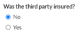
This block renders a list of radio buttons, of which one can be selected. Each option has a key and a value attribute. Both the key and the value of the selected option are persisted to the block state.
For each option, the label displayed next to the corresponding radio button will be the option value, in title case.
Properties
Property | Definition |
|---|---|
|
|
|
|
|
|
|
|
|
|
|
|
Example
{
    "block": {
        "key": "was_third_party_insured",
        "type": "radio",
        "title": "Was the third party insured?",
        "description": "Was the third party vehicle involved in the accident insured?",
        "default_value": "No",
        "options": [
          {
            "key": "no",
            "value": "No"
          },
          {
            "key": "yes",
            "value": "Yes"
          },
        ]
    }
}
State
| Property | Definition |
|---|---|
"type" | String. The block type, in this case "radio". |
"option_value" | String. The value of the option currently selected. |
"option_key" | String. The key of the option currently selected. |
{
  "claim": {
    "block_states": {
      "was_third_party_insured": {
        "type": "radio",
        "option_value": "No",
        "option_key": "no"
      }
    },
    ...
  }
}
Dropdown
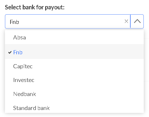
Renders a dropdown element with a list of options, from which the user can select one option. Each option has a key and a value attribute. Both the key and the value of the selected option are persisted to the block state.
For each option, the label displayed in the dropdown list will be the option value, in title case.
Properties
Property | Definition |
|---|---|
|
|
|
|
|
|
|
|
|
|
Example
{
    "block": {
        "key": "bank_for_payout",
        "type": "dropdown",
        "title": "Select bank for payout:",
        "options": [
          {
            "key": "absa",
            "value": "ABSA"
          },
          {
            "key": "fnb",
            "value": "FNB"
          },
          {
            "key": "capitec",
            "value": "Capitec"
          },
          {
            "key": "investec",
            "value": "Investec"
          },
          {
            "key": "nedbank",
            "value": "Nedbank"
          },
          {
            "key": "standard_bank",
            "value": "Standard Bank"
          },
        ],
        "default_value": "FNB"
    }
}
State
| Property | Definition |
|---|---|
"type" | String. The block type, in this case "dropdown". |
"option_value" | String. The value of the option currently selected. |
"option_key" | String. The key of the option currently selected. |
{
  "claim": {
    "block_states": {
      "bank_for_payout": {
        "type": "dropdown",
        "option_value": "FNB",
        "option_key": "fnb"
      }
    },
    ...
  }
}
Input currency
A numeric block designated with a specified currency. Renders an interactive input element that displays the currency symbol and two decimal points. The values are persisted as integers in cents on the block’s state.
Properties
Property | Definition |
|---|---|
|
|
|
|
|
|
|
|
|
|
|
|
|
|
Example
{
    "block": {
        "key": "payout_amount",
        "type": "input.currency",
        "title": "Payout amount",
        "isoCode": "ZAR",
        "placeholder": 10000000,
        "max": 25000000,
        "min": 5000000,
    }
}
State
| Property | Definition |
|---|---|
"type" | String. The block type, in this case "input.currency". |
"value" | Integer. The current value of the block. |
{
  "claim": {
    "block_states": {
      "payout_amount": {
        "type": "input.currency",
        "value": 10000000
      }
    },
    ...
  }
}
Input number
A numeric block that accepts an integer or floating point value. The user interface renders an interactive input element that only accepts numeric input.
Properties
Property | Definition |
|---|---|
|
|
|
|
|
|
|
|
|
|
|
|
Example
{
    "block": {
        "key": "number_of_beneficiaries",
        "type": "input.number",
        "title": "Number of beneficiaries",
        "placeholder": 1,
        "max": 5,
        "min": 1
    }
}
State
| Property | Definition |
|---|---|
"type" | String. The block type, in this case "input.number". |
"value" | Integer. The current value of the block. |
{
  "claim": {
    "block_states": {
      "number_of_beneficiaries": {
        "type": "input.number",
        "value": 1
      }
    },
    ...
  }
}
Input text
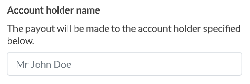
A free text element used to capture shorter string fields.
Properties
Property | Definition |
|---|---|
|
|
|
|
|
|
|
|
|
|
|
|
|
|
Example
{
    "block": {
        "key": "name_of_account_holder",
        "type": "input.text",
        "title": "Account holder name",
        "description": "The payout will be made to the account holder specified below.",
        "placeholder": "Mr John Doe",
        "max_length": 25,
        "min_length": 5
    }
}
State
| Property | Definition |
|---|---|
"type" | String. The block type, in this case "input.text". |
"value" | String. The current value of the block. |
{
  "claim": {
    "block_states": {
      "name_of_account_holder": {
        "type": "input.text",
        "value": "Mr John Doe"
      }
    },
    ...
  }
}
Input paragraph
This block is used to capture longer text input, for example where a full description of the incident needs to be captured. It renders as a form input into which the user can enter a paragraph of text.
Properties
Property | Definition |
|---|---|
|
|
|
|
|
|
|
|
|
|
|
|
Example
{
    "block": {
        "key": "incident_description",
        "type": "input.paragraph",
        "title": "Incident description",
        "placeholder": "On the date of the incident, the following occurred...",
        "max_length": 500,
        "min_length": 150
    }
}
State
| Property | Definition |
|---|---|
"type" | String. The block type, in this case "input.paragraph". |
"value" | String. The current value of the block. |
{
  "claim": {
    "block_states": {
      "incident_description": {
        "type": "input.paragraph",
        "value": "On the date of the incident, the following occurred..."
      }
    },
    ...
  }
}
Input time
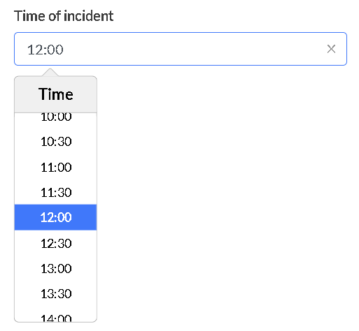
A block that accepts the time of day in the ISO 8601 time format. On the frontend, this block allows both direct string input and displays a time picker.
Properties
Property | Definition |
|---|---|
|
|
|
|
|
|
|
|
|
|
Example
{
    "block": {
        "key": "time_of_incident",
        "type": "input.time",
        "title": "Time of incident",
        "placeholder": "12:00",
        "default_value": "12:00"
    }
}
State
| Property | Definition |
|---|---|
"type" | String. The block type, in this case "input.time". |
"value" | String. The block's current value. |
{
  "claim": {
    "block_states": {
      "time_of_incident": {
        "type": "input.time",
        "value": "12:00"
      }
    },
    ...
  }
}
Input date
A block that accepts a date in the ISO 8601 date format. On the frontend, this block allows both direct string input and displays a date picker.
Properties
Property | Definition |
|---|---|
|
|
|
|
|
|
|
|
|
|
|
|
|
|
Example
{
    "block": {
        "key": "date_of_death",
        "type": "input.date",
        "title": "Date of death:",
        "default_value": "{{ dateNow }}",
        "placeholder": "{{ dateNow }}",
        "max": "{{ dateNow }}",
        "min": "2021-01-01"
    }
}
State
| Property | Definition |
|---|---|
"type" | String. The block type, in this case "input.date". |
"value" | String. The current value of the block. |
{
  "claim": {
    "block_states": {
      "date_of_death": {
        "type": "input.date",
        "value": "2021-07-29T13:56:47+02:00"
      }
    },
    ...
  }
}
Group
The block enables grouping nested blocks related to a specific context.
Properties
| Property | Definition |
|---|---|
"key" | String. The unique identifier for this block |
"type" | String. The block type, in this case "group". |
"title" | String. The text that will be rendered as the group's title. |
"blocks" | Array. An array of sub-blocks, each representing an input field within the group. |
"collapsible" | Boolean. Defines whether the group can be collapsed or not. |
Example
{
    "block": {
      "key": "police_block",
      "type": "group",
      "title": "Provide the following details:",
      "blocks": [
        {
          "block": {
            "key": "police_station",
            "type": "input.text",
            "title": "Police station reported",
            "max_length": 25,
            "min_length": 0
          }
        },
        {
          "block": {
            "key": "investigating_officer",
            "type": "input.text",
            "title": "Investigating officer information - name and contact number",
            "max_length": 25,
            "min_length": 0
          }
        },
        {
          "block": {
            "key": "case_number",
            "type": "input.text",
            "title": "Case Number",
            "max_length": 25,
            "min_length": 0
          }
        }
      ],
      "collapsible": false
    },
    "show_if": "{{if (ifCondition claim.block_states.claim_type.option_key '===' 'accidental') '||' (ifCondition claim.block_states.claim_type.option_key '===' 'unnatural')}}"
  }
State
| Property | Definition |
|---|---|
"type" | String. The block type, in this case "group". |
Note that each nested block saves on the claim record at the same level as the group block.
{
  "claim": {
    "block_states": {
      "police_block": {
            "type": "group"
        },
       "police_station": {
            "type": "input.text",
            "value": "Tokai"
        },
      "investigating_officer": {
            "type": "input.text",
            "value": "PC Wayne"
        },
       "case_number": {
            "type": "input.text",
            "value": "ABCDE1234"
        },
    ...
  }
}
Display conditions
Display conditions allow you to customise the claims workflow by hiding or disabling certain blocks based on other block states, or based on existing claim, policy or policyholder information. You can also use the required_if parameter to define conditions under which the input for a given block will be mandatory.
All display conditions are optional.
"show_if"
"show_if"Default value: true.
If the value is truthy, the Block will be visible, else it will be hidden. If this condition is specified, "hide_if" will be ignored.
"show_if": "{{ifCondition claim.status '===' 'open'}}"

"show_if": "{{ifCondition claim.block_states.claim_type.option_key '===' 'accidental_death'}}"
"hide_if"
"hide_if"Default value: false.
If truthy, the Block will be hidden, else it will be visible. If "show_if" is specified, this condition will be ignored.
"hide_if": "{{ifCondition claim.policy.sum_assured '<' 2000000}}""disabled_if"
"disabled_if"Default value: false.
This property is only relevant for form element blocks. If truthy, the block will be disabled, effectively making it read-only. The value of a disabled block can't be changed via the frontend but it can still be changed via the API. A disabled block’s value(s) will still be visible on the dashboard.
"disabled_if": "{{ifCondition claim.policy.module_data.life_benefit '===' 'expired' }}""required_if"
"required_if"Default value: false.
This property is only relevant for form element blocks. If truthy, and the block has no value, the form input will have a red border applied on the frontend, indicating that a value is required. If this property is false, it will have no effect on the styling of the block on the dashboard. This property does not have any effect when retrieving and updating block states over the API.
Note that when a block has "required_if": true, and has a missing value, this will not prevent the claim from progressing. In other words, a claim will still be able to pass through the full process from opening to approval if a required input is missing.
"required_if": "{{ifCondition claim.block_states.has_excess_applicable_check.value '===' true }}"Updated 3 months ago